


The whole time I was working on this project I kept saying, "Oh My! This just isn't going to work out." I get like that sometimes when I am drawing too. Sometimes you have to complete the journey for it all to come together and make sense, if I didn't know this from my experience drawing, I would have scrapped this project before it even got going....LOL
Overall I have to say I was extremely happy with the way my mini notebook turned out.
What I did was was, wash my hands because I had about 3 pieces of Hershey's Nugget Candies while contemplating. LOL I find that chocolate calms me when I am about to embark on unfamiliar territory in the craft room. LOL
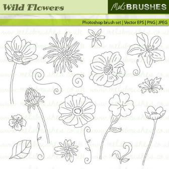
I printed out about 6 flowers on white card stock. I cut them out and cut all but 1 apart. I then proceeded to crumple them up, put them through the crimper a few times and then smoothed them. Next I took out some Martha Stewart pigment ink pads in yellow, orange, pink and red and proceeded to bounce these inks all over all the flowers and pedals. After that I used some cuttlebug dry embossing folders to add texture. Finally I added more pigment ink to bring out the embossing. I then glued the various pieces onto the full flower after curling them all with a pencil. I used my crop a dile and punched a hole in the middle of the flower and on the cover and secured using an eyelet. I used a brad to decorate the center.
To make the cover I used white card stock and bounced pigment inks all over it and then dry embossed and smeared on more pigment inks to bring out the embossing. I then used my crop o dile to punch holes along the left side and slit each punched whole in the middle so it would fit over the wires. I wanted the word Notes to look the same but not get lost in the background. So I printed some brown grunge paper I made on my computer on beige card stock. I then took pigment inks to each letter after cutting. The font fit perfectly with this theme and is called Big Top. I then added ribbon in various colors and cropped each diagonally. Then being a former bow chick, I heat sealed the ribbon so it wouldn't fray.


7 comments:
I agree with you that this is not a type of challenge that is easy for me either. You did a great job! Love the notebook.
You did a wonderful job. So elegant.
Awesome! I agree not my normal style and I had a hard time myself! LOL... but lookie at what we all made..
Loved your Note book... very chic and aged looking.. Great Job!
Dardi, you did a wonderful job with this challenge!
I love the notebook. I think you did a good job of making it vintaged and distressed. It's too pretty to write in. LOL
Your notebook is great, Dardi! I agree with you about the vintage/distressed style - not my strong suit! You did a great job with this project!
Love the colors and the layers on your flower. Great job.
Post a Comment